
Ever notice how some outfits immediately grab your attention while others seem to drift by unnoticed? Designers use an age-old trick called color theory, a bit like a secret recipe, that fills each look with mood and emotion. They mix primary colors (the base ones you see every day), secondary colors (a mix of two primaries), and even tertiary colors to spark creativity in every piece.
Imagine the gentle sway of a silk scarf or the crisp snap of a perfectly cut jacket. These designers blend classic experiments with light and color to shape modern collections that leave a lasting impression. It’s like they’re painting with style, turning every outfit into a little work of art.
So next time you’re admiring a vibrant ensemble, remember: it’s not just clothes. It’s a carefully crafted burst of color and emotion that can transform your day.
color theory in fashion design: Bold and Beautiful
Color theory in fashion design has roots dating back to Sir Isaac Newton’s 1666 color circle. Newton’s playful experiments with light and color gave us a glimpse into how our eyes, feelings, and culture come together to create design magic. Designers now lean on these ideas to grab attention, spark emotions, and set just the right mood for a collection.
Let’s start with the basics: red, blue, and yellow are the primary colors. Think of them as the essential building blocks of every other hue. When you mix these, you get secondary colors like orange, green, and purple. Blend those a little more, and you discover tertiary shades such as red-orange and yellow-green. Fun fact: before Newton created his color circle, artists mixed colors by trial and error until one lucky blend changed the game.
The main ideas in color theory are hue, saturation, and value. Hue is simply the pure color, for example, a clear blue. Saturation tells you how vivid or lively that color appears, while value refers to how light or dark it is. Combined, these elements work together much like the layers of a catchy song, building the overall atmosphere of a design.
In fashion, these simple ideas act like a roadmap for creativity. Designers match colors thoughtfully to shape the look of each piece, ensuring every garment feels fresh, modern, and inviting.
Mastering Color Harmony Techniques for Textiles and Apparel

Designers working with textiles know that color harmony formulas can turn plain fabrics into real eye-catchers. They use these trusted color palettes to add balance and a bit of sparkle to every collection. Ever noticed how one color in many different tints can create layers of depth, much like a rich musical chord? For example, a monochromatic look might use one hue in both light and dark tones, imagine a soft, sky blue silk blouse paired with strong navy details.
Designers also love trying complementary combinations. Colors on opposite ends of the color wheel often work well together, giving a look that feels both lively and calm. Then there’s the split-complementary style, which mixes one main color with two colors close to its opposite. This method offers plenty of room for creative prints and patterns. Block color techniques, like analogous and triadic schemes, offer fun ways to blend textures and prints while keeping the overall look fresh and unified.
| Scheme | Definition | Use-Case |
|---|---|---|
| Monochromatic | Variations of one hue using different tints and shades | Creates a cohesive and understated look |
| Complementary | Colors located opposite each other on the wheel | Offers striking contrast without clashing |
| Split-Complementary | Base color with two adjacent colors to its complement | Provides dynamic contrast with balanced appeal |
| Analogous | Colors next to one another on the color wheel | Produces a harmonious and soothing palette |
| Triadic | Three equally spaced colors on the wheel | Delivers vibrant energy with balanced distribution |
When designers apply these color formulas, they can mix and match fabrics and prints to build collections that shine on the runway and feel great for everyday wear. Each piece becomes a blend of smart design and true style.
Understanding Psychological Impacts of Color in Clothing Design
Color in clothing is more than a trendy detail. It shapes how we feel and see an outfit. Designers pick shades that can calm us, boost our energy, or even bring back sweet memories. Picture a deep blue dress that softly whispers peace or a bright red top that instantly fills you with passion. These colors work their magic not only on the person wearing them but also on everyone watching.
Different parts of the world see colors in their own way. For example, white is often seen as pure and fresh in many Western cultures, while in some Asian cultures it can be a sign of mourning. Red might signal celebration and luck in China, yet in the West it could feel like a warning. So, designers must think about these differences when their work reaches different cultures.
| Color | Feeling |
|---|---|
| Blue | Calm and relaxed vibes for everyday wear. |
| Red | Passion, excitement, and a bold style statement. |
| Green | Freshness and balance, perfect for nature-inspired looks. |
| Yellow | Optimism and joy, a great choice for bright, sunny styles. |
| Purple | Luxury and creativity with an elegant touch. |
| Orange | A warm and friendly vibe that makes outfits inviting. |
When designers understand these color feelings, every fabric and thread turns into a tool to craft an experience. It’s like creating a mood that speaks in a language everyone can feel. Have you ever noticed how just one perfect color can change your whole day?
Essential Tools for Color Palette Selection and Mood Board Creation
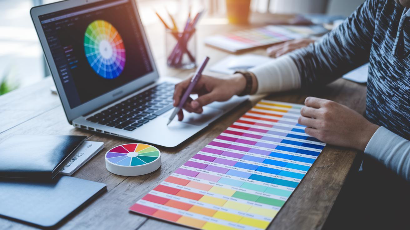
Designers often start by choosing colors with both digital tools and hands-on methods. Tools like Adobe Color, Pantone Connect, and Coolors.co help you mix and match shades easily. It’s a bit like trying different spice blends to add unique flavor to your design.
Online color pickers and mobile apps let you see how colors work together in real time. Imagine adjusting a hue on your digital sketch and instantly noticing its effect on the whole outfit. This live feedback makes it easier to decide on the best look without waiting for the final production.
Even old-school methods have their charm. Many designers still love using pencil sketches and hand-drawn swatches to capture a color’s true vibe. Some even suggest checking out guides like “Sketching for Fashion Design” (https://fullswag.com?p=286) to see how different tints and tones compare in real life.
Creating a mood board is key to pulling your ideas together. A good tip is to stick with three to five colors so your look remains focused and stylish. Label each swatch with its Pantone or RGB values to keep everything clear as you build your collection. This playful yet thoughtful approach helps you find just the right balance for your design.
Forecasting and Incorporating Emerging Color Trends in Fashion Design
Runway shows these days are all about bold, bright colors that feel fresh and fun. Designers are experimenting with big blocks of primary colors, soft pastels, and even a sprinkle of neon pop. One creative mind even added a flash of neon to a classic silhouette, turning a simple piece into a statement. This mix of daring hues with gentle shades creates a color palette that’s both eye-catching and balanced.
Next up, forecasts predict a burst of high-impact brights for 2025, a lively mix that feels energetic yet refined, while the following season will lean into soothing earth tones. Data from Fashion Trends 2024 shows that these vivid colors bring a youthful vibe and a polished touch when paired with softer, natural shades. Imagine a bold fuchsia paired with a warm, sandy beige, just like a runway set that surprises you with its perfect harmony. Designers are being encouraged to blend warm and cool tones to create collections that feel as unexpected as a refreshing summer breeze.
At the same time, eco-friendly methods are reshaping how we think about colors in fashion. More designers are choosing low-impact, plant-based dyes and recycled pigments to make their pieces as sustainable as they are stylish. This smart use of new dye techniques not only cuts down on environmental impact but also tells a story of mindful design. It’s a neat way to mix fashion flair with a promise to protect our planet.
Case Studies: Iconic Color Applications in Contemporary Fashion Collections

Yves Saint Laurent’s 1965 Mondrian dresses changed how we see color in fashion. These dresses use clear blocks of bright, primary colors outlined in bold black, making each patch pop like a perfectly placed puzzle piece. It’s like every square has its own story, yet they all come together to create one unforgettable look.
Gucci’s Fall 2023 collection took color to a whole new level. The designers mixed different patterns and soft shifts in tone to give each piece depth and movement. Imagine layering colors like you would mix a cool playlist of your favorite beats, each layer adding a bit more surprise and spark to the look.
There’s also a fun behind-the-scenes look from a popular T-shirt line. Here, designers doubled down on balancing red with blue and red with orange right from the cutting and dyeing stages. They knew that while red brings energy, it needs to play nicely with cooler blues and warmer oranges. This careful dance of hues shows that smart color matching isn’t just about picking shades, it’s about placing them just right to boost the whole design.
For more inspiration and design prompts, check out Fashion Design Ideas.
Each case study reminds us that thoughtful color use can totally transform a garment and add life to every collection.
Final Words
In the action, we explored fundamental concepts like hue, saturation, and value as well as how they blend to shape modern apparel. We pictured the impact of our choices, from mixing digital tools with hands-on techniques to creating visually appealing palettes. Each section reminded us how color theory in fashion design helps evoke moods and bring collections to life. There’s a refreshing spark in every swatch that infuses new purpose into style, lifting the creative spirit and inspiring brighter, bolder looks.
FAQ
Color theory in fashion design pdf
The Color Theory in Fashion Design PDF explains how colors work together for a balanced look. It covers basic ideas like hue, saturation, and value to help designers match shades and set a mood in collections.
Color theory fashion skin tone
The Color Theory Fashion Skin Tone guide shows how certain hues work with different skin tones. It explains which colors can brighten or flatter your complexion to create a harmonious look.
Importance of color theory in fashion design
The importance of color theory in fashion design lies in its power to set the mood and draw the eye. It guides designers on how to mix hues effectively for standout, mood-driven collections.
Color in fashion design
Color in fashion design refers to using hues to create a look that feels fresh and engaging. It shapes trends, influences mood, and makes garments more appealing and memorable.
Color in fashion definition
The definition of color in fashion centers on the use of hues, saturation, and brightness to express style. Designers use it to transform simple fabrics into artful expressions that capture attention.
Fashion designers that use colour
Fashion designers that use colour, like Yves Saint Laurent and Gucci, creatively mix bold hues to craft memorable collections. Their innovative use of color inspires trends and sets a stylish tone in the industry.
Colour psychology in fashion PDF
The Colour Psychology in Fashion PDF explores how various hues affect mood and style perceptions. It offers insights into choosing colors that evoke feelings, making outfits feel dynamic and thoughtful.
Color theory fashion book
The Color Theory Fashion Book serves as a guide for understanding how colors influence design. It explains basic principles and modern techniques to help transform garments with smart color choices.
What is the 3-3-3 rule for clothing?
The 3-3-3 rule for clothing refers to selecting three core pieces, using three key colors to build an outfit. This rule simplifies styling and helps maintain a balanced, coordinated look.
What are the 7 types of color theory?
The seven types of color theory include complementary, analogous, triadic, tetradic, split-complementary, monochromatic, and neutral schemes. Each scheme offers guidelines for combining colors thoughtfully in designs.
What is the 70 20 10 rule for colors?
The 70-20-10 rule for colors suggests using 70% of a main color, 20% of a secondary color, and 10% of an accent color. This method creates a balanced visual impact in any design or outfit.
What is the 7 rule for outfits?
The 7 rule for outfits means keeping your look simple by limiting the number of different pieces or colors to seven. This approach helps maintain a clear, stylish, and well-composed outfit.
